avintos AG
Weidenweg 17
4310 Rheinfelden
Switzerland
Contact us
Tel: +41 (0) 61 836 15 30
infoavintos.ch

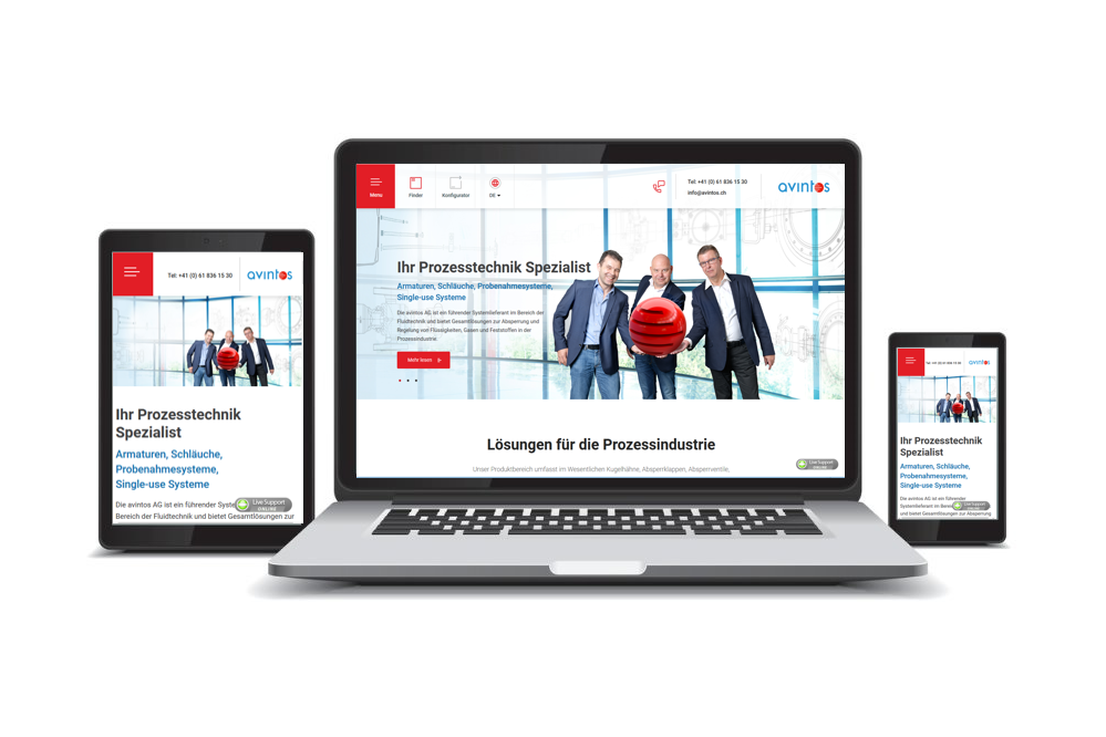
New design, user-friendly and of course responsive. We have set the following priorities with the development and organization of the new side:
Responsive
The website was developed according to the Mobile First approach. Whether Smartphone, Tablet or Desktop. The content is presented attractively on all devices and is easy to use.
Product finder
With our new product finder, you can quickly find the right product based on various criteria such as manufacturer, design or application. And we can already tell you – it’s getting even better! - An absolutely new product configurator will be created here soon! If you want to be among the first to use this unique configurator, register here with your e-mail address and you will find out first hand when we go online.
Have fun discovering the new website.